First impressions
First impressions - The evolution of a book’s cover design
Book cover reveals are exciting, and designing your book’s cover is thought to be the fun part of publishing a book — the icing on the cake. For many, including myself, the design process can be suspenseful and laced with moments of anxiety and uncertainty because it’s often outside of our control. Authors following the traditional publishing route hand over their masterpiece to an editor, who shares the book’s key themes with their graphic artist colleague, who generates the design concept.
While writing and editing the book, I shared my book’s cover on social media, and several people noticed it change over time. I received many questions about how I chose my final cover, so I thought others might be interested in my cover design experience and what to expect when working with a publisher.
As the saying goes, first impressions are everything. You want a reader to walk up to the bookshelf and immediately gravitate to your book. But what makes for a good book cover? Notably, the book’s title needs to be prominent, easy to read and memorable. The overall cover design should be visually inviting and even have an element of mystery to prompt the potential reader into picking it up or clicking the link to find out more.
For me, having an image of the book’s cover also made my book feel real. Silly, I know, but it was my first book, and I half expected my book deal to evaporate as if waking up from a dream. One of the first things I did when I started writing the book in 2017 was to design a mock cover for myself.
I highly recommend doing this if you are writing a book. In moments of self-doubt and dwindling inspiration, looking up at a picture of your future book will lift your spirits. Building your future cover is also fun and exciting. You can even import your design to generate a 3D mock image of the book using DIY Book Design’s free tools.
My self-designed corkboard pin-up cover
It didn’t matter if the title changed or if the publisher reconfigured the final design — I needed something to pin up on my corkboard to push me toward my goal.
I wanted something simple and abstract. When my mother saw the aura, the colours appear to her like fireworks. I strived for a similar effect on the cover. I launched Adobe Illustrator and got to work…
Although my subtitle was long and cumbersome, it told potential readers what the book was about. In the end, though, the main title was the only thing to survive through to the final book cover.
During the book’s revision process, my editor sent an email asking for photographs, ideally images that included my mother and me when I was younger. Immediately I thought of this perfect picture:
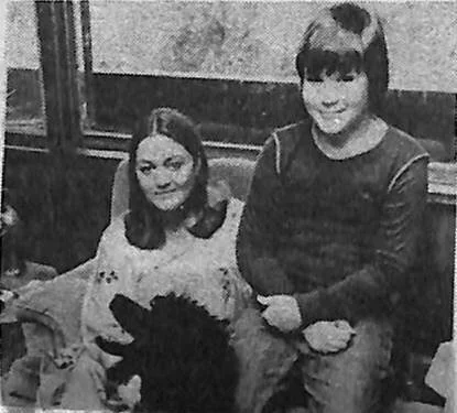
Picture from Midnight Globe article, July 31st, 1979
The problem? I didn’t own the licensing rights. The original photograph was taken in 1979 and appeared in a tabloid article titled “Psychic Finds Secret of Auras.” I tried to purchase a license, but the magazine was defunct, and the parent company had no record of the original photographer. Licencing can be expensive, and while the larger publishers have a budget to allow for this, a personal photograph for my cover made the most sense.

Ectoplasm?
We decided to use a photograph that had significance. In Chapter Six, I’d mentioned one photo as a symbol of my father’s spiritualism bias. When I had sent the picture to my father by email, he immediately noticed the shimmer in the bottom left corner, saying it looked like “ectoplasm,” a supernatural substance released by some mediums while in a trance. (To learn more about the bizarre history of “ectoplasm”, click here.)
The aberration on the picture had a perfectly natural explanation, though. I had snapped a picture of the photo with my iPhone, and the cellophane sheet protecting the photo created the reflection. His reaction alerted me to his possible inclination for supernatural explanations rather than a rational alternative.
The designer at Random House Canada used the original picture for the first official version of the cover.

Cover: Version 1
Some authors don’t get any say in approving a cover, but I was lucky that my vote counted. I loved the subtle effect of the crystal ball and instantly approved of the cover. Unfortunately, it wasn’t well-received by book retailers who were concerned about its online visibility, especially when viewed as a thumbnail. Viewed in this way, the cover was dark and the type challenging to read. In other words, back to the drawing board.

Cover: Version 2
The next version went bright and bold but unfortunately included several pictures we didn’t have the license to use. The artist wanted to combine science elements with a retro feel, given that a good chunk of the book took place in the 70s and 80s.
While the title was prominent and vivid, I was not fond of this version because I wanted only to include graphics that had significance to the book’s contents. I didn’t feel the yellow dots and flowers belonged.

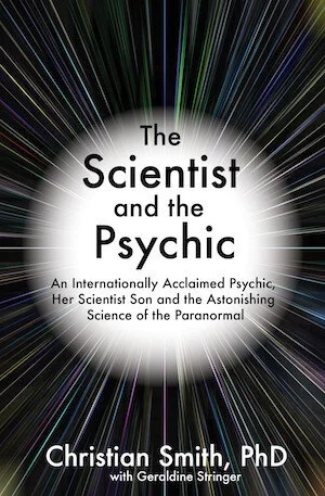
Cover: Version 3
The next version was a winner. The original picture from the first cover version returned, and the radiating lines and coloured triangles represented the aura colours my mother saw in her psychic readings. The only revision I requested was to tweak the colours to match the most common aura colours discussed in the book: green, gold and blue.
And with that, the final cover design was born.
